How I made Subpixel
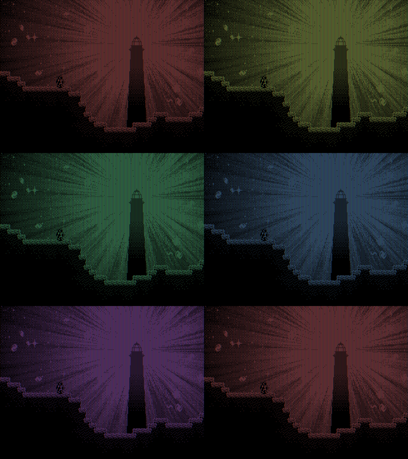
Well I can hardly believe it but I managed to finish Subpixel in time for Pixel Day. It was so last minute, I made that background above the day of, shortly before I published the game. Two games in one month, and both of them were too close to the deadline.
But now I can finally talk about how I made this game, because I used a lot of weird tricks to achieve the visual effects, and I had to do a lot of *gasp* M A T H to program the gravity mechanic. Maybe if you’re having trouble figuring out how that works, this post will help you understand it. (I really tried to make this game not hard…)
How gravity works
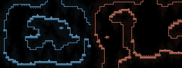
Most scenes have an invisible boundary between one direction of gravity and another. They can be horizontal, vertical, or diagonal boundaries. Some scenes have 4-way gravity with four diagonal lines around a center point the player falls towards (or away from). Here are some examples, showing the boundaries and directions of gravity.

When you cross a vertical or horizontal boundary, gravity reverses. It was simple to program; in the middle example above, I just check if the Y position of the player is less than or greater than the Y coordinate the boundary is at. There are also some scenes where you fall away from this line instead of towards it, and others where the direction of gravity is perpendicular to the line.
When you cross a diagonal boundary, gravity “rotates” by 90 degrees, and I had to do more complicated math to calculate if the player’s position is on one side of the boundary or the other. The equations for these lines are just y = x, or y = -x. So in the example on the left, I check if the player’s X position is greater than their Y position. In other words, are they farther to the right than they are down? (in Stencyl the coordinates start with 0, 0 at the top left, so as Y increases it goes down instead of up.)
Then I have to offset it by where the boundary is, since it usually doesn’t start at 0, 0. And for y = -x, I have to somehow reverse the player’s X position by making it negative and then adding the screen width. I don’t fully get it, but it works.
It’s one of those cases in math and programming where figuring out something that seems simple at first is actually super complicated, and can be more confusing than it feels like it should be. But I think I got something that feels somewhat intuitive to play.
False tiles and warping
The other mechanics in this game are much simpler. Starting in the caves, some tiles will be fake and you can move through them. And later on, you’ll find invisible tiles that you still collide with. They’re just a copy of the tileset with no collision shapes, and transparent tiles with collision shapes.
Warping is also simpler than it sounds. Usually when you cross one edge of the screen, you reappear at the opposite edge. But sometimes you won’t end up exactly across from where you were. In this example, the arrows point to where you’ll warp to.
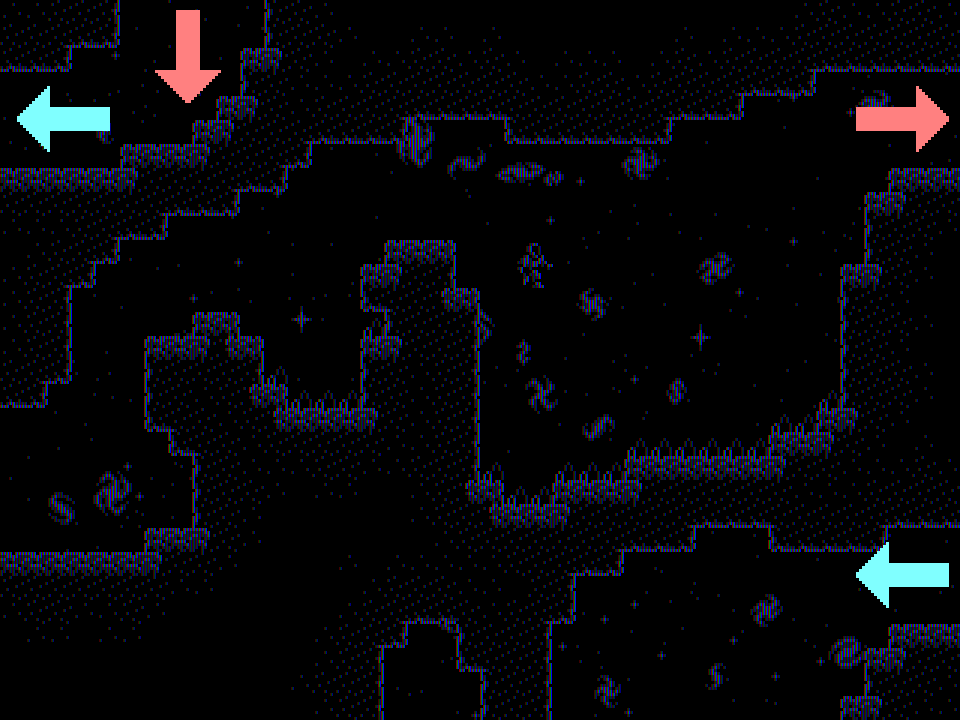
Normal warping is easy to code. For example, if the X position of the player is less than 0 (the left edge of the screen), I just set their X position to what the length of the screen width is (that’s the right edge). But I couldn’t figure out a smart way to do the weird warping where I break that rule, not in time for Pixel Day. So I just put individual checks in every scene, which is messy but it works.
How I made the visuals
The original idea was a game with onebit graphics where the colored pixels would constantly hue-shift, creating a rainbow effect. I decided to deviate from actual onebit and added another darker color, just because I thought it looked better. It gave the graphics depth and shading, and made the onebit style look flat in comparison. So that’s why Subpixel is “onebit-inspired.”
But I also came up with another, way more ridiculous excuse that I like to call…
⋆ ★ Q U A N T U M O N E B I T ★ ⋆
…where every pixel on the screen is either on, off, or both at the same time at any given moment. In other words, they’re either black, colored, or colored at 50% opacity. This idea was so fascinating to me that I was looking for any opportunity to make a game with this visual style, and Pixel Day turned out to be perfect for it.
So how did I make this work in a game? Stencyl is a great engine, but it’s not without its quirks. And if I were to constantly apply effects to everything on-screen, surely that would cause catastrophic damage to my already traumatized computer. So I have to use as few objects (called “actors” in Stencyl) as possible.
The player, shooting stars and twinkling stars, the pause menu, and some text on the title screen are all actors. They’re tinted with the current color, and some of them also have an additional black outline actor behind them that doesn’t get the effect.
But everything else you see in a scene is a tile. The ground of course, but also the sky, and even the title on the title screen. I imported those entire images as tilesets instead of backgrounds, because they all have to be on the same layer, and here’s why.
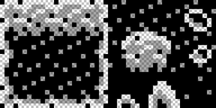
Every pixel in a tile that would be colored is transparent in the image file. Then the color goes on a separate layer behind the tiles. So if I had a normal background behind the tiled ground, or if I had more than one tile in the same place but on different layers, the black pixels would overlap the transparent pixels and cover up the colors.
Also, I tried just setting the background color, but that caused a massive memory leak to constantly hue-shift. So instead I created a single pixel “actor” that’s literally just a 1x1 pixel, stretched it to the entire screen width and height, and then applied the color effect to it.

The result is indeed very cool in my opinion. But then while I was experimenting with the graphics, I got an even better idea.
Subpixels
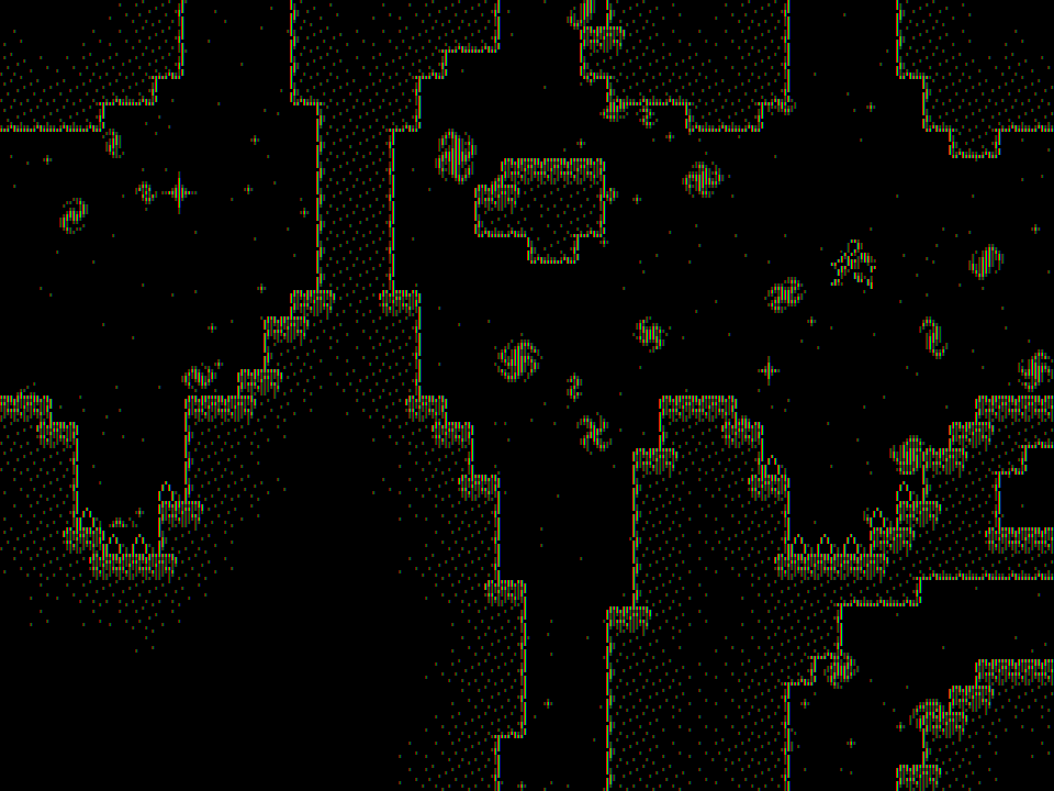
That screenshot isn’t yellow (*Vsauce music plays*). Instead, if you zoom in far enough, every “pixel” is actually a 3x3 square of pixels with red on the left, green in the middle, and blue on the right.
These are called subpixels, and basically every computer screen has them. They use the additive RGB color model where, in the screenshot above, the red and green subpixels are on, and the blue subpixels are off. The red and green light combines to appear yellow.
I figured out that I can just draw 3 red pixels in a vertical line, then 3 more green ones next to it, and 3 more blue ones next to that, and when you zoom out it works the exact same way. So every pixel is really made of 9 pixels in a 3x3 square, and the game is three times higher resolution than it looks. And simulating these subpixels using pixels that are in reality also made of subpixels creates this really cool visual effect.
To make them appear to change color, I replaced the hue-shifting pixel actor behind the tiles with 3 repeating backgrounds for each of the 3 colors; red, green, and blue. Then instead of applying a tint effect, I change the opacity of each color. In the above screenshot, red and green are both at 100% opacity, and blue is at 0%. For actors like the player, they’re actually made of 3 individual actors each red, green, and blue that change opacity the same way.
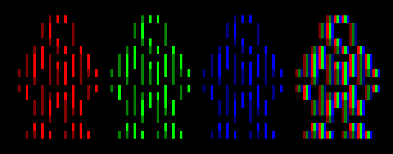
It’s honestly one of the coolest things ever. And it makes me want to make more pixel art using this style, because this is only 1% of my power. Imagine if I used a palette of more than three colors. There are so many more ways I could explore this idea.
A Universe of Waves
So I have a game about how, fundamentally, everything you see on the screen is made of just three colors. Three slightly different wavelengths of light. And I also have a song for this game that (well, besides the percussion) is made of triangle waves and square waves with different pulse widths. But even with percussion, they’re all mechanical sound waves anyway.
It turns out there’s something even more fundamental than subpixels here, and it encompasses more than just the visuals. Just like how, in reality, quantum particles may actually be made from excited states in a field, or one-dimensional vibrating strings.
I will once again state that I am NOT an expert on these topics, and I am not qualified enough to be taken seriously. I just think it’s really cool. I’ve spent a lot of time watching Youtube videos and reading Wikipedia articles about these kinds of things, and they’re great inspiration. But I have no scientific education beyond high school, and I refuse to believe anyone who tells me I’m smart. I just make the pixels go brrr.
Some other silly quirks Subpixel has right now
Sometimes the player will face the wrong way as they move, usually when they switch to a non-downward direction of gravity. It might not be that hard to fix, but in the meantime you can moonwalk on the moon.
(itch.io isn't letting me upload more gifs, so here's a link to it)
Jazz_horse found this while she was testing the game. It happens when you cross a diagonal boundary and press and hold both the direction keys that are opposite both the directions of gravity (in this case, gravity is down and to the right, so I press left and up). There are several more places in the game where you can do this, too.
(another link where my gif should have gone)
Sometimes when you land on a corner that’s on a diagonal boundary, this happens. It’s a little tough to get out of it, you just have to keep trying to jump and move around. All I really have to do to fix this though is add a tile there, and there won’t be a corner to get stuck on.
I think that’s pretty much everything I wanted to say. I hope everyone had a great Pixel Day. It’s honestly hard for me to keep up with how many people are here that are way more talented than me. Maybe one day I’ll stop making everything for my games myself.
Subpixel
A game about the fundamental particles of computer screens.
| Status | Released |
| Author | Immanent Death |
| Genre | Platformer |
| Tags | 1-bit, 2D, Colorful, Gravity, moon, Pixel Art, Retro, Singleplayer, Space, Stencyl |
| Languages | English |
Leave a comment
Log in with itch.io to leave a comment.